[ I started writing about the new version of my subway map in progress here in Making a Subway Map I in May. ]
As I predicted, it was so hot this week that I didn't do much at all on the diagram.
The alternative plan of taking a break and writing something completely different for a week didn't work out either. I've mentioned before that the stories and essays depend partly on thinking time during my walks and runs. Because of the foot injury I mentioned last time, I haven't had any of that time. I can walk enough now for daily routines, but there's always a little pain, so I haven't felt like doing additional walking for exercise. Yesterday I ran about ten feet in a parking lot, just to do it. Grrr! I might do something crazy like see a doctor about this.
Here's a very early stage of New Jersey, with the old diagram showing through. This was July 3. I'm just working out how the Hudson shoreline should run before I start drawing lines. The first try was the lines that run straight past Hoboken and then bulge out symmetrically around Exchange Place. The revision pushes the Hudson to the right past Hoboken.

Next, below, is 24 hours later— clock time not work time!
The Hudson now becomes wider as it goes down. It now bulges at Hoboken and Jersey City. The shore around Lincoln Harbor lines up with the shore down in Bayonne.
This went pretty fast once I started on it. A few hours. It's not radically different from before except that Newark is relatively farther to the left.

I made the end of the Newark Light Rail at Grove St be a right angle instead of the awkward hook it had on the old map, which had been done to show that Watsessing Ave railroad station is farther away from Newark than Grove St. I think that is still implied in the new version.
I made the Hudson Bergen Light Rail branch to West Side Ave at a 45 degree angle to make lettering easier, but then I took it back and made it a right angle again, as you can see below.
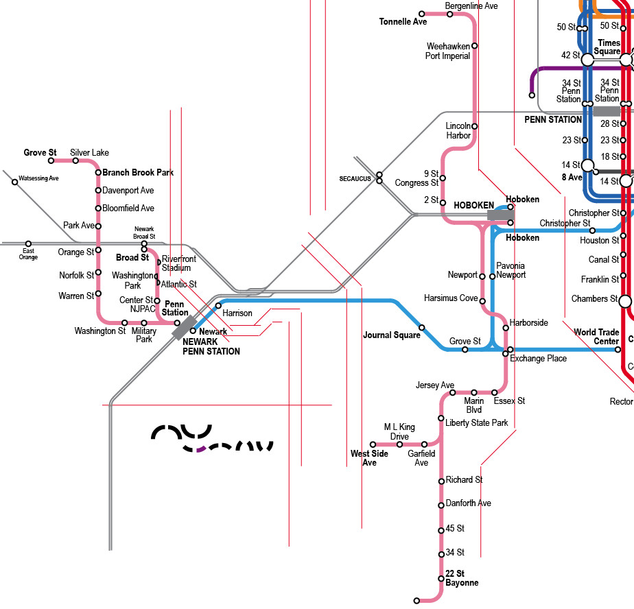
Bayonne is now a little taller. There was an intermediate state, not saved except in the small complete diagram in last week's post, where it was even taller than this.
This all has to do with things not on the diagram that might possibly be expected to line up at a future time. Oh, I know more than anyone, it's a diagram not a map, but I like to limit my distortion. Let me just show you the real world, rotated to make the Manhattan avenues into vertical lines. Here:

This is the area where the subway and light rail lines are. The circle is over the Manhattan business district.
Looking at New Jersey: X= Exchange Place. N= Newark, B= Bayonne. The diagram rotates them slightly but three make almost an equilateral triangle. This is not necessary for a topologically correct map but since it works out it's good to do it.
Here's a twist though: if you start at X, and drop straight down until you can go straight left to N, that's roughly how the Light Rail runs, as far as West Side Ave. The diagram makes that look unlikely. Really, who cares, since you can't travel that way. It just gives you an idea why I wanted at least to have that branch run straight left.
What's really striking is how much New Jersey shrinks compared to the city side. Bayonne is about as far down as 59th St Brooklyn, and almost as far as Coney Island (C), and you'd never guess that from the diagram. Newark is almost as far from Midtown as Jamaica (J), but is shown as much closer on the diagram. This is pretty normal stuff though for a transit diagram. I think experienced users read a diagram that way, expecting distances to be greater as the eye gets farther from the center.
It's going to get worse. Wait till I squeeze the Staten Island Railway in the lower left corner. As shown above, at scale it would eat up the lower third of the whole diagram, and it is not going to get anything like that space. The official Transit Authority map of 2010 puts it in a separate box to emphasize how much it is displaced and out of scale with the rest. I won't do that at least.
We'll also get the Newark Airport light rail people mover thing, once I've done more on the mainline railroads. It's the only transit line not connected to the other transit lines. It's pretty close to a horizontal elevator car too. Should I even show it in pink as a light rail line? It runs on rails. I think so.
Continued: Making a Subway Map IX.
No comments:
Post a Comment