Sunday, March 28, 2010

Crooked Brook I


Be it known to all whom it may concern: that at the request of Jonathan Crane and Nathaniel Wheeler, of Newark, Gentlemen: I have surveyed for them a tract of land lying between the Rahway River and Crooked Brook, within the bounds of Newark aforesaid...South and west by said Crooked Brook; north, Ebenezer Tompkins; east, by said river...

— Document dated March 10, 1713/1714, quoted in Shaw's History of Essex and Hudson Counties.


I referred to this document in Stone House II. Wait! No! I'm not going on and on about stone houses again. This time we're going to explore the Crooked Brook.


Our journey is not an easy one, because parts of the Crooked Brook are underground now. And because it really is a crooked brook, the parts that you can see run in different directions, as if they had nothing to do with each other. Until I wrote Stone House I didn't realize myself that they were all the same brook.

It's funny that some residential property developers treated the Crooked Brook as a picturesque feature that would increase value, while others hid it in a large pipe and tried to pretend it wasn't there. But that's what happened.


We will begin the expedition at the mouth of the Crooked Brook and work our way upstream to the mountain. You can come too.

I bet you're thinking of the great explorers seeking the source of the Nile. Except for certain details, like this brook isn't famous and the distance can be walked in about an hour, it's pretty much like that.


The Crooked Brook debouches into the East Branch of the Rahway River within the confines of Memorial Park. Here we are at the mighty confluence of waters.


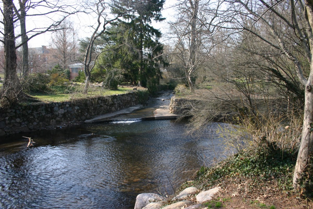
That's the Crooked Brook straight ahead, entering the East Branch, which flows right to left.

As we go upstream among the budding plants of early spring, we come to a wooden footbridge. The Maplewood Public Library is on the left.


As beautiful as it is, this is a managed stream with stone wall banks most of the way and a stone floor. As we round a bend in a wooded area we come to a portal.


Our task now is to determine the path of the Crooked Brook from here to the next place where it is above ground.

One thing that happens in the hidden depths is a fall that should have been enough to power a mill. I think I can hear it at the portal, but I am not sure. It's too bad we don't get to see it.

Now look at this thing. You can see it at the top of the previous photo.


Not far above the portal, at Dunnell Road, is a concrete barrier that would be pretty useful if there were something like a brook here. As it is, it protects pedestrians on the sidewalk from falling into a lawn.

I've seen this for years and I've laughed at it. But it's right on the course of the Crooked Brook if it continues straight on from the portal.

Here's the smoking gun! An aerial photograph from circa 1921 shows the Crooked Brook from its mouth right up to this concrete railing.


The park is in an early state here. The houses to the left of the Crooked Brook were later removed, and the half-built street you can see at lower right was obliterated. I don't know why a little more of the brook needed to be covered, relocating the portal such a short distance downstream.

But let's say it was necessary. The question is, why was the concrete railing left in place when the opening it protects was eliminated? You know why? It probably wasn't in the work order. You know how it is.


The map below is tiled together from Sanborn insurance maps dated 1912. We've come from the Rahway River on the right up to the portal at the street shown here as Oakland Road (now called Dunnell Road). The dashed line under the road has the label STONE CULVERT.


Beyond the railway, the Crooked Brook is no longer above ground.


Below, we have our backs to the railway, and we're looking upstream based on the location shown in the Sanborn map. The old post office to the left of the stream (shown in pink, for a brick building, with the lettering P O) was replaced by a one-story building of which the white-sided part is on the post office site and the green-painted part (Geralyn's Art Studio) is over the stream. Beyond, the faux half-timbered building is shown on the Sanborn map at the corner of Maplewood Avenue and Highland Place. The stream runs immediately to its right, therefore under the left side of the brick building (which houses St James's Gate pub on the ground floor).


Pulling back for the full view, we see an oddly angled piece of concrete at the bottom of the image. I think it's the remains of the portal on this side of the railway. The portal itself was probably under the concrete path we're standing on, which is partway up the railway embankment.

The railway embankment itself dates from a reconstruction project carried out in 1901-1903, which included construction of the present Maplewood station, the elimination of the Baker Street grade crossing, and widening of the line with a third track. The remains here and the useless barrier on the other side may date from that time. There was probably a simple bridge over the Crooked Brook before that.

Between the angled concrete and the green-painted building, there is a grating right in the middle of the parking lot that must be right over the brook. But it's a shallow drop, and I can't hear the brook running in it.


If we go around that block of buildings to their fronts on Maplewood Avenue, we find no trace of the brook.

But the STONE CULVERT shown on the Sanborn map is visible in the old postcard shown below. There's the old post office on the left, and just before it is a low wall with an iron fence on it. That's where the brook is. The same low wall and fence is on the right, too. The three-story building is not yet standing on the right, so this view is earlier than the 1912 Sanborn map.


Looking at the modern view, the location of the culvert was from where the pedestrian is walking, in front of Geralyn's Art Studio, to a spot between the Guinness sign and the American flag in front of St James's. The storm sewer next to the pedestrian must drain to the brook, but like the one in the parking lot it is shallow. The site is the lowest elevation on Maplewood Avenue.


From St James's, if you walk around the corner into Highland Place, and then walk up the first driveway between buildings, you end up in a small paved yard right behind St James's. It's private property but I think they won't mind too much.

Here's the Crooked Brook. Right there. That round grate. If you stand right next to it, you can hear the brook flowing down below and you can see the moving water in the darkness. This opening goes straight down the brook.


What a suspenseful moment! When will we see the brook again in the sparking sunlight? You'll just have to wait.


My photographs were taken on March 20 and 27, 2010. The aerial photograph is from Images of America / Maplewood by the Durand-Hedden House and Garden Association, Arcadia, 1998. The postcard of Maplewood Avenue is from Postcard History Series / Maplewood by John F Harvey, Arcadia, 2003. The Sanborn maps are from Insurance Maps of South Orange Village, including South Orange and Millburn Townships, New Jersey, by Sanborn Map Company, 1912, scanned by Princeton University.


Next time: Crooked Brook II.

Sunday, March 21, 2010

Subway Map III


(Subway Map II is here.)

Subway Map III: Express and Local

Last time I rambled on and on about using symbols for express and local stations. Among comments in the nyc.transit newsgroup was this from Joe Korman:

Way back in the 1970's I was on the TA map committee that designed the original version of the current map. ...

One of the things the committee agreed on was the *express* and *local* designations. We came to an understanding that it needed to be broken into two parts:

The physical attribute of the line (two-three-four tracks) and platforms

The stopping pattern of the trains that use those tracks.

For example, at the time, the *F* was called the 6th Ave Express, but it ran local in Manhattan, express in most of Queens, express daytime between Continental and 179th, and express in Brooklyn in the rush hours.

The result was the the verbose chart that appeared for years afterwards, showing for each marker letter or number, by time of day and by borough, whether it was express or local. I think the chart format was an improvement over the paragraphs of text that had been in use.

The number of cases of trains running express in one section and local in another has greatly increased starting in 1967. It is very difficult to express the routings graphically if we insist on the letter and number markers as the basic units that must be shown.

It's interesting that the committee suggested giving up on showing routings by colored lines, and created a test map with all the lines in red and all stations shown by blobs. That's as simple as you can get. The marker letters and numbers still cluttered the map by being shown next to every station name and also by colored circles next to the red lines at strategic points.

Notice on the proposed red map that the 1967 colors for markers were still in use. The final plan adopted and seen on maps since 1979 was to color-code by main lines, so that for example the 1, 2, and 3 all became red instead of three different colors. The new colors required changing an enormous number of signs throughout the system.

The ten colors are a nice synthesis of the pre-1967 three-color concept and the fairly wild concept (from 1972) of different color shades for all twenty-four markers. Now the colors actually meant something. All the green routes ran on the Lexington Ave Line, for example. But no names were assigned to the colors.

I think they missed an opportunity to simplify by not naming the colors. I think all the diagrams since 1967 have had a problem with level of abstraction, an insistence on including minutiae of train routings that could be left off the system map.

Here's an extreme example of how names could be used on a station entrance sign at street level.  It's extreme because there are only a few stations with services on four main lines. But even here it reduces eight things to four things. In most cases there would be only one or two line names.


Why this is better is that some service changes would not require new signs. For example if the train service to the Nassau St Line changes from M to J, no change is needed on the entrance signs. If there is no longer any service to the Nassau St Line, the sign needs changing, but that's a bigger difference.

As an example: some years back the 2 and 3 swapped terminals in Brooklyn, and all the stations beyond Franklin Ave needed changes to their entrance signs even though the change made no difference to people riding between Brooklyn and most Manhattan points. The stations still had Seventh Ave Line service, and only people riding north of 135th St Manhattan cared about the change.

A really secondary point is that at Borough Hall, the part-time Nassau St Line service does not need to be listed first. That was done solely because letters come before numbers (apparently) and M is the first letter here alphabetically. In my graphic I have put the Lines in what I think is the order of passenger traffic from this point.


Actually what I was going to write about today was the problem of trains that run express in one place and local in another. There weren't many before 1967 but there were some.

The IRT system had the prime example dating back to the opening of the Brooklyn lines beyond Atlantic Avenue in 1920. A couple of track maps I made in 1996 are here and here. First let's see what the problem is.

The local trains on the IRT's two Manhattan main lines ended (and still do) in lower Manhattan: the Lexington Ave Line at City Hall (later Brooklyn Bridge) and the Seventh Ave Line at South Ferry. The express trains continue to Brooklyn by separate routes and come together at Borough Hall. So far so good. But from Borough Hall out the Brooklyn main line to Utica Ave, it's a four-track subway built in the usual manner with express and local stations. The layout of the tunnels routes the Seventh Ave Line to the local tracks. Therefore, from 1920 to the present, Seventh Ave express trains are local trains in Brooklyn.

How do we show express trains running as local trains?

The Interborough Rapid Transit company map took the obvious course. Just use the symbols for express and local stations.


There's a lot of ambiguity here. The two simple circles at Borough Hall raise the most questions: whether some trains skip the station (no) and whether trains coming in via Clark St end there (no). But you know what? People figured it out.

Hagstrom and others followed the same convention. I won't show you. The original Hagstrom in 1936 even copied the idea of showing Borough Hall as two local circles, but changed eventually to two express circles, as part of the new concept of using express circles for all stations where express trains stopped (see Subway Map II for more than you want to know about this).

For the new Transit Authority map in 1958, a new convention was adopted of showing the Brooklyn IRT as two parallel lines. By doing this, the stations could all be shown with the express station symbol, and even more importantly it was finally clear which express trains ran as locals. Here's a 1964 map.


There's one little oddity there. Nevins St and Atlantic Ave are shown with two station symbols, although they are single stations, but at Franklin Ave the two lines combine for one station symbol. The difference is not the physical layout of the stations, since Nevins and Franklin both have two island platforms allowing easy change between trains. I think the main reason was to simplify showing the junction just east of the station. Both express and local trains ran to both the Flatbush and New Lots branches (at various times of day).

(By the way the numbers 4 and 5 near Franklin Ave are not train markers. They indicate the location of two points of interest, the Brooklyn Museum and the Brooklyn Botanic Garden.)

Once the 1967 changes were made, the whole thing looked much simpler! No, I don't mean it. Here's a 1968 map.


It's still clear that the Seventh Ave Line, or, as shown, the 2 and 3, runs as the local service. The name rectangles are a little oddly placed, with the red line for 2 barely touching some of them. They just don't play well with all the diagonal lines in this area of the diagram.

Notice the red names for the stations with both express and local service, so to speak.

(Digression. Notice that DeKalb Ave, where six lettered train routes stop, is not shown with a red name! I mentioned its peculiar nature in Subway Map II: four tracks facing two island platforms (a conventional express and local station) plus two bypass tracks without platforms. All earlier maps I have seen showed it with the symbol for an express station.)

And here's the current generation of subway map. As we saw previously, it uses blobs for express-only stations. That provides a way to make the combined express and local stations stand out, as they should. Using separate colors for the IRT Seventh Ave and Lexington Ave routes pays off here too.


It's a little odd that the double blobs form complete circles on the branch to Flatbush Ave but paired half-circles west of there, but it still seems clear. Nevins St should have the express and local symbol, but the diagram is really cramped for space right there, so maybe we can overlook that anomaly.

The most awkward thing is the extra green line between Atlantic Ave and Franklin Ave. Overnight, the Lexington Ave Line runs local to the Flatbush Ave branch, so there need to be green blobs (half blobs) at the local stations, but doing that obscures the point the Lexington runs express when most people would be riding, and so we need the extra line to show that! But then there's an inconsistency: in the next section from Franklin Ave to Utica Ave, the Lexington runs express during the same hours, but the graphical representation is different. Why? Because it does not run there overnight at all, so no green blobs are needed at the two local stations. It's a little unsatisfying as a graphic.

Did I just say that using red and green "pays off"? Maybe not. If the two IRT main lines were the same color, this would look simpler. (It would also look simpler up in a section up in the Bronx.)

Another way to make the diagram simpler is not to show routings that happen only overnight.


There are other cases, but I will spare you. One is the Queens IND lines ; both the F, which Joe Korman mentioned, and the E have always run as express trains in Queens but local trains in Manhattan. Another is the IRT's "Through Express" trains in the Bronx on the Third Avenue El and the West Farms (2 and 5) line, where some express trains continued to skip stations where other express trains ran as locals. The bottom line is that the concept of trains being express or local never did work.


I might eventually continue this with a discussion of transfer stations, but I want to move on, so I won't do it now.


Next time: Crooked Brook.

Sunday, March 14, 2010

Subway Map II


(Subway Map I is here.)

Subway Map II: Express or Local


One of the thorniest problems with a New York subway map is how to show express and local services. It is not enough to show lines and stations: you also need to show that some trains skip some stations.

What I'm saying might sound obvious or simple. I want to state the obvious first, and then show you why it's not simple at all.

On a four-track line, express and local trains both stop at an express station, and only local trains stop at a local station. And on a two-track line, all trains stop at all stations.

Subway stopping patterns are very closely tied to the physical structure, the arrangement of tracks and platforms. When a train comes to a station platform, it stops. Express services are run where there are third and fourth tracks that do not run next to platforms at some stations.

It doesn't have to be that way. The Metro North, Long Island, and New Jersey Transit systems schedule many trains to run past platforms without stopping. There can be a great variety of stopping patterns, some unique to one train, so it is not useful to show them on a map.

On the subway however there is great regularity. An express station has platforms facing all the tracks ; a local station does not. This is so standard that it something feels slightly wrong when the paradigm does not match the train service. For example, some elevated sections have a third track not used in normal service, but some of the stations have platforms facing the third track and some do not, and they feel like express and local stations even though there is no express and local service.

The strangest anomaly is DeKalb Avenue station, Brooklyn, where there are six tracks, four of which run past platforms. To force it into the standard paradigm, it is usually understood to be an express station with bypass tracks.

I'm running through all this stuff just to suggest that the idea of express and local stations has something to do with the way they are built, not just the train service that is offered.

Let's see what the mapmakers did.

The influential maps were the company maps of the Interborough Rapid Transit system and Brooklyn-Manhattan Transit system, and then the first map showing all subways, created by the Hagstrom company.

The Interborough company's map led the way by using two types of circle to show local and express stations. The fine detail exceeded what cheap color printing could handle, as seen here in a very late example from 1937. The Brooklyn company's designer improved on the idea by using simpler circles, but overloaded the circles with a second feature showing where the company thought passengers should transfer between trains. Hagstrom adopted the best of both ideas: simple circles.


But what do we do on an outer section of line where trains stop at every station? What are those stations? They aren't express stations, because there is no express service, but they aren't local stations either, because calling them local stations would imply that some trains skip them.

Let's see what the mapmakers did with that.


Here's the IRT company map showing part of the west side line. Reading the map from the bottom, only local trains stop at 86th St and 91st St, express and local trains stop at 96th St, and then... what happens at 103rd St and 110th St? Only local trains, or all trains?


Maps by Geographia, Hagstrom, and Voorhies all follow the convention of the IRT company map. These all date from about 1936 to 1940.


Hagstrom eventually changed to show 103rd and 110th as express stations.


What did trains really do? Up to 1959, there were four services up to 96th St, and an express and a local went to each branch. The locals ended at 137th St (Broadway) and 145th St (Lenox), and the expresses continued to the end of the line. North of 96th St, all trains made all stops.

But how should this be shown? As interpreted by the old IRT map and its followers, the express station symbol implies that there are both express and local trains on the segment. As eventually reinterpreted by Hagstrom, the express station symbol means that express trains stop, meaning that trains that run express somewhere stop. That idea actually falls apart in places, but we'll get to that later on.

The Transit Authority map, 1964. By this date, all local trains ran up Broadway and all express trains ran up Lenox. Therefore, the local station symbol, a crossbar, is shown at 103rd St and 110th St (Broadway), and the express station symbol at 110th St (Lenox).


The Transit Authority's 1967 map showed stations by a box containing the markers of trains that stopped. This lets us see that the 1 train is the only one stopping at 86th St, and the only one stopping at 103rd St and north, while the 2 and 3 skip 86th St, and so on.

One of the things the Transit Authority were doing starting in 1967 was de-emphasizing the categories express and local. There were getting to be numerous trains that ran express in part of their run and local in another part. They were hard to categorize. Thus under this model, the 1 is not so much the local as it is the only train that stops at 86th St.

But there was a holdover: the reason the name of 96th St is in red is that it is a station where both express and local trains stop. That's what the old dotted circle really meant. A stop where both express and local trains stop.


The Vignelli map eliminated the boxes and the red names. You could see graphically that only the 1 stopped at 86th St, because only the 1 had a dot in its color line at that location. The boldface name at 96th St tells us that it's a stop for both express and local, although that's also clear from the dots. For a case where boldface adds something not already clear, keep reading.


The current generation of official map— this is an early version from 1980— went back to different symbols for express and local stations but finally introduced a third station symbol to code those special stations that have both express and local trains. Is this the right way to do it?

Why is 103rd St a tick and a 110th St (Lenox) a solid circle? The difference shows us that somewhere else the trains at 110th St (Lenox) run as express trains. It's almost a throwback to the pre-1967 maps. The difference is just that the different symbol for stations with both express and local makes them stand out a little— although Hagstrom did that by making the express circle a little larger, something so intuitive that it's not mentioned in the legend. That's nice design.


Now, would I beat a dead horse? Sure.

Here's another similar case, the BMT line under Fourth Avenue, Brooklyn. It's a four-track line to 59th St, and then it splits into two branches. The service has not changed since it opened: the locals continue down Fourth Avenue to 95th St, and the expresses turn into the Sea Beach branch (to 8th Avenue and off to the right side, in all these maps).

The BMT map handled this exactly like the IRT map. It looks like the express trains stop at 36th St, 59th St, and then run past the next stations. A difference is that the 95th St branch is so short that you can guess at a glance that only local trains run there, since even the last stop is local only.


The stations with double rings seem important, and especially the ones with black centers, but you'll need to read the legend (reproduced up above) to find out why.

Note in passing: the BMT map has another feature not explained in the legend. The width of the line corresponds to how many tracks there are. There are sections with two, three, and four tracks in the view above.

Not surprisingly the Geographia, Hagstrom, and Voorhies maps all follow the convention and show the Sea Beach stations as local.


And once again, Hagstrom's reinterpretation eventually showed the Sea Beach stations as express stops. Notice that 36th St and 59th St have larger circles.


The Transit Authority map follows the same convention.

The 1967 map (this is a 1968 edition) gets the same idea across with the RR and N train markers in boxes. The special stations for both express and local are named in red, as we saw before.


The Vignelli map runs into a problem. Because the yellow N train was now scheduled to make the local stops at 45th St and 53rd St at night, its line has dots at those stations. The boldface names at 36th St and 59th St clue you in (or do they?) that those are stops for both local and express trains, but which train is the express? Unless you knew the insider code (no longer in use today) that a single letter N is express and double letter RR is local, you'll need to read the small-type service guide, or pay attention when you ride.


The reality of a train being express and local at different times is hard to code on a map, and I don't want to knock this particular solution too much. The idea on the Vignelli map was to that if a train made the stop at any time, put the dot.

In Subway Map I I raised the question of what level of detail to show on a system map. Maybe all that needs to be shown is that there are both express and local trains, because that clues in the reader that not all trains make all stops. Maybe the detail of which trains make which stops, at different times, is more than we need to show on a system map. Keep that in mind.

The current generation of map shows 45th St and 53rd St more clearly as local stations, and handles the N express or local through a convention of listing the train markers at every station. The boldface italic N means it always stops, while the plainface N means it sometimes stops. But whether you get that or not, you definitely get the idea from the map that there are express and local trains on that section, and that's the main thing.


Let's take another case of trouble with part-time patterns. We don't need to go way back for this one. The Brighton Beach line was pretty simple up to 1967: both express and local at Prospect Park, Church Avenue, and Newkirk Avenue, and local in between. The express did not run overnight. The usual express and local symbols told this story, on the BMT map, the Hagstrom map, and the others. Here's the 1964 Transit Authority map. (The extra line at Prospect Park is the Franklin Avenue Shuttle.)


Then the reroutings of 1967 made it get interesting.

Here on the 1968 map, it looks like the D and QB and QJ trains all make all stops. Wait, no, the red names indicate stations with both express and local service, and some are not red. So, some trains skips those black stops. Sometimes. That seems to be what it says.


The Vignelli map is just as unclear. Dropping the dashed lines for special rush hour services looks nicer but gives the barely-there QB equal billing with the other two services (now called D and M), which makes it even harder to guess what the service here is.


Should that much detail be on the system map at all?

The current generation of map does a much better job of differentiating the local-only and express-and-local stations, by using the big open circles. If you can interpret the train marker code at the station names, differentiating plain type from bold italics, you can even figure out what is going on with the train service. The D is the one that skips some of the stations, right?


This is another case that is very hard to show graphically. What we've got here is both express and local service on weekdays, and only local on nights and weekends. That's not too hard, but the marker D is the express when there is an express and the local when there is only a local. If we were not so concerned about showing the marker letters, maybe it would be easier to show the main point that there are both express and local services.

An odd result is that the local stations show three train markers with none in boldface italic— no train stops there 24/7. But there is some train service 24/7! That's more important.

(By the way, even with better registration than we have on this particular copy, it looks like the M is separated by whitespace from the other two line colors. I don't know why. If anything is to be separated, it should probably be the orange D that runs sometimes as an express.)


You know something, there are even crazier things that have to be shown on a New York map. But for that, you will have to wait till next time.


The 1937 IRT and BMT maps are from Mapping New York by Seth Robbins and Robert Neuwirth, London: Black Dog Publishing, 2009. The Hagstrom maps from 1936 and 1956 are from Twelve Historical New York City Street and Transit Maps by John Landers, Flushing NY: H & M Productions, 1997. The rest are from my collection.

For a long time there were two basic Hagstrom maps. The large one, our 1936 example, was sold in Hagstrom's line of pocket maps, and while it was the official subway map (1940-1958) it was posted in cars and stations. The smaller one, our 1956 example, was used as a foldout in guidebooks published by Hagstrom and others.


Next time: Subway Map III.

Sunday, March 7, 2010

Game of Chicken


I'd be feeling even more great if the snow would stop— we're getting more Monday night!— and if the morning air would be above freezing. That's all I ask.

That was me, three weeks ago. "That's all I ask." Ha. I forgot something. I also ask to be in good enough health to run. I took that for granted.

So, it's another week of being sick, and so Subway Map part deux once again is not done. In fact I went as late as Sunday afternoon thinking I might not have anything for you this week, but then some show on cable reminded me of an incident I was going to write about a long time ago. It's not as long as I usually go, and I was trying to think of something else to combine it with, and I never did. Anyway, here you go. Remember, this is better than nothing.


__________


We get take-out food a lot. It's like we never left the city. Or never left college.

There's this chicken place in town that we had not tried, and one day I was told to go get some chicken pieces there. I won't name it, in case there's some liability here. There are no tables. It's just take-out. They deliver, or you can go to the counter in person. It's over near Seton Hall University, and I think the college students are a good part of the business.

Whatever time this was, I was the only customer there. I looked at the menu and saw that I had a choice of several degrees of spiciness : mild, hot, burning, four alarm, all points, nuclear, and thermonuclear.

Is thermonuclear really an intensifier of nuclear? I don't know the terminology.

It's funny. Many years ago I didn't like hot at all, and Helen had to talk me into eating spicy Chinese or Indian food. But that changed. Now she says hot hurts her stomach, while I'll order Chicken Vindaloo when we're not going to share it.

I decided to order a small bucket, just hot. The counterman questioned me.

"You could get burning. It's pretty hot but you might like it."

"No, my wife doesn't like it too hot. Let's stick with hot, and see how that is, and maybe next time."

"OK, hot." He wrote it down on an order slip and clipped it to a little wheel behind him where the cook could see it.

It was going to be ready in a few minutes. I stood near the counter and watched cars go by outside.

A young guy, probably a college student, came in. He took a look at the menu.

"Let me have a large bucket, thermonuclear."

"No. That's too hot to eat. Nuclear." The counterman wrote it down and was about to put it on the little wheel.

"No, I want thermonuclear."

"It's too hot to eat." The counterman paused. "I don't know why we still have that on the menu. Nobody can eat that. Nuclear." He turned again to put the slip on the wheel.

"No, we like it really really hot. Give me thermonuclear."

"Look." The counterman sighed. "You want something so hot you need to wear gloves to touch it? Something so hot you'll get third degree burns on your tongue? They'll have to take you to the hospital? You'll have to get fed intravenous for a few days while you recover?"

"Yes. That's what I want."

"Well, that's nuclear." He turned again to put the order slip on the wheel.

"I really want thermonuclear."

The counterman looked sad. He looked back and forth as if to assure himself that I was the only witness to what was about to happen. As if to make sure the Authorities were not watching.

"OK, I will give you thermonuclear. But you have to sign this form."

He reached under the counter and took out a half slip of paper. It was a printed form. I could almost read it from where I was standing.

"Here. Sign this."

I got a better look. It said something like this:

I have been advised that thermonuclear chicken is too hot to eat and is a danger to my health. I have decided of my own free will to order it anyway. I will not hold the staff or management of XXXX Chicken responsible for the consequences of my decision.

The young guy hesitated a moment and then signed it. The counterman closed his eyes and shook his head. With a sigh, he signed it. "Hey Al," he called.

The cook came out. He saw the form.

"Oh no." He looked sad. He looked at the young guy. "Are you sure?"

"Yes! I want thermonuclear."

"Oh my God." Al, the cook, signed the form as a witness. "Remember, this is your decision."

"OK! I want thermonuclear."

"You don't know what you're doing." Al turned to the counterman. "We have to take that off the menu." Al went back into the kitchen, shaking his head regretfully.

The counterman took a date stamp and stamp pad from under the counter, and turned the date to the right day, and inked the stamp and marked it on the form. He put the form into a small box, and put the stamp and pad away.

"Next time, I can say I already signed that, right?"

"Kid. There ain't gonna be a next time."

The cook came out with a bag and gestured to me. "Here's your order. Enjoy!"

I left. I never found out what happened. The chicken wasn't that great so I didn't go back.


Next time: Subway Map II.