I made a New York subway map in 1995 just for fun, and I first put it on my web page at Columbia that June. This was part of my explanation page back in November 1995:
My current diagram is here. Although I felt I had made great advances when I changed the version numbers to 2 and 3 and 4, there isn't really a lot of difference. Much of the fault is with the software I used to create it. I chose it solely because it came with the computer and it was able to do the modest job I asked of it. I have been apologizing for it for years now.
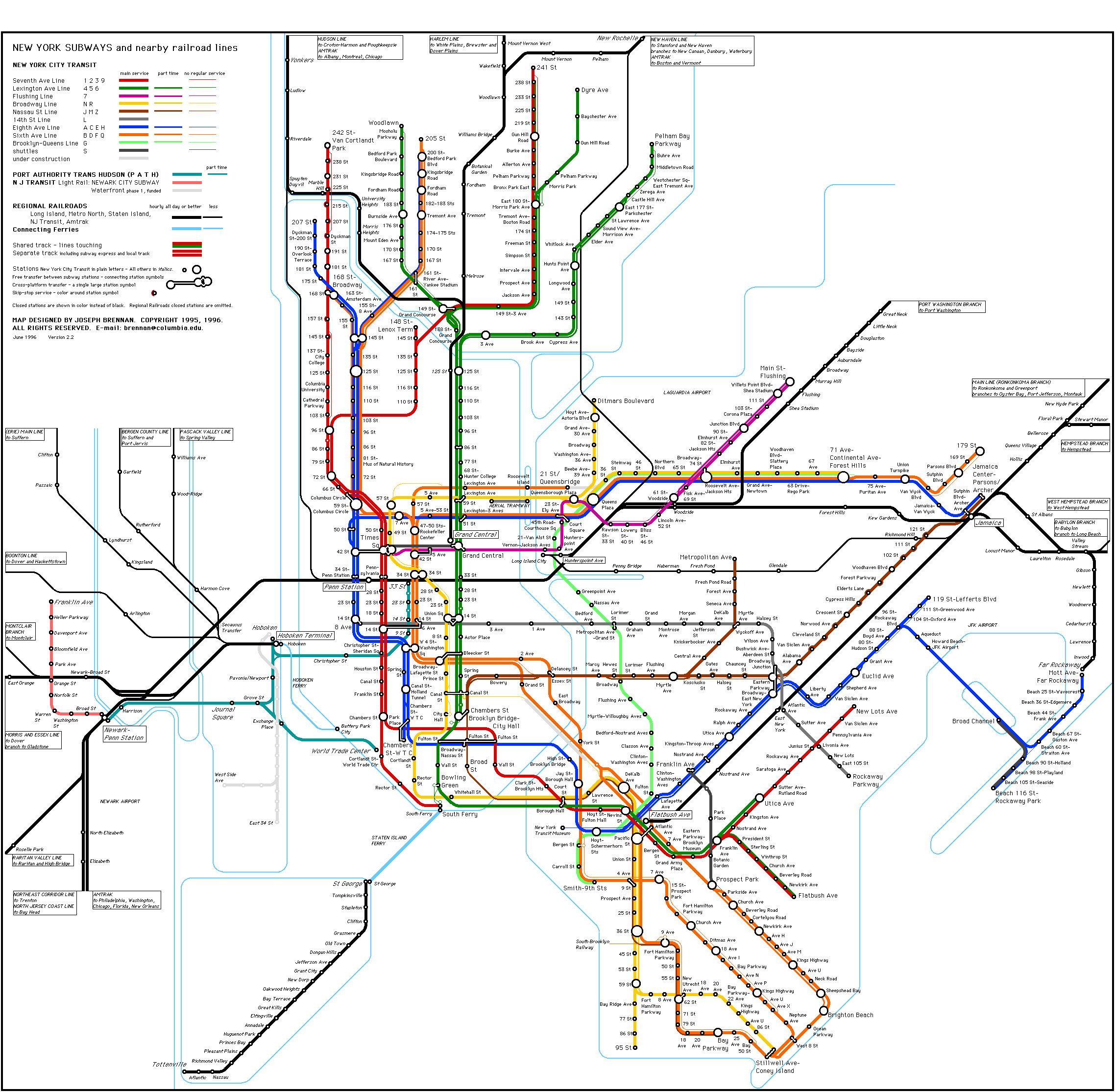
Once in a while I am asked for a better quality version for reproduction, and am not sure that 21st century people can believe me when I tell them that the source really is, no kidding, 72 dpi. The diagram just looks terrible when it's printed out, and there is nothing to be done about it. You can see the ragged pixellated edges and many small misalignments. The kindest thing you can do is reduce it to 50% size, since that hides the worst of the problems. The portion that was reproduced in Mark Ovenden's book Transit Maps of the World is even smaller than 50%, for which I am quite grateful.
The time has come— and you might say it came a decade ago— for me to re-draw the thing with decent software. I have put it off long enough. I don't like to be hasty. But comes a time.
Two weeks ago I set out to make a new diagram and learn Adobe Illustrator. Both things at once.
My goal is to have a new map by the time the Transit Authority makes significant service changes in late June. It is good to have goals. They make you realize how little you can accomplish in a given period of time and what pathetic creatures we humans are.
I don't remember exactly where I started drawing fifteen years ago, but there's a chance it's the same place I started this time, which was the Lexington Avenue line north from Brooklyn Bridge. I am sure that I started with Manhattan below 60th St and then worked out from there.
I am not just copying over the existing diagram. As I go along I want to fix some things in it that have bothered me for a long time, but were too difficult to change without a lot of re-drawing.
Here is what I have so far. This is very much a work in progress, and even this apparently finished part will change before the whole thing is finished.

I'm letting you see two things that will be gone later. The black lines in the upper right are the standard curves that are used throughout the diagram. And there are two experimental line patterns in the lower right that I might use for part time service and routes under construction.
The current map is there as background. The new Lexington (green) line is directly over the old, but some other parts are shifted somewhat from where they were.
The lettering is taller than before. It's Arial Condensed. I have a lot of fonts to choose from, including even a copy of P22 Johnston Underground that I purchased a few years ago, but after I spent some time trying out quite a few of them, I decided the common boring Arial Condensed just looked better than anything else. So pending any second thoughts, I think it's what we're going with.
I need to do the lettering as I go. Remember, it's a diagram, not a map. The spacing of the line segments is affected by how long the station names are. Important examples are Broadway - Nassau Street and Broadway - Lafayette Street, both of which appear in crowded areas. I left out the hyphens. If I do want to change the font it could force me to move some lines around.
Up to now I have used thinner lines to show part time service and no regular service. That was done partly because I had no alternative. Claris Works only drew solid lines of different widths. What I am planning to do now is have the same width lines throughout, with patterns to show less than fulltime service. I think this will be more clear, and it will also facilitate changing between full time and part time services as services change over time. Changing line widths sometimes required redrawing and shifting parts of the map. Changing between solid line and pattern lines is simple. The sample you see here has just plain lines.
Two old problems that I have fixed are the Broadway Line (yellow) from 14th St to 42nd St and the Seventh Avenue Line (red) from 42nd St to 66th St. Both used to twist in an awkward way that I always thought was not totally necessary. It was just that fixing them would require making large changes in the diagram. The shift of the Sixth Avenue Line (orange) to the left was done partly to straighten out the Broadway Line but also to open up more space for station names south of 34th St. I think it looks better now.
Another little twist I removed was in the Flushing Line (purple). It now forms a clean horizontal line across Manhattan all the way over to the section under construction west of Times Square. Since the portion from Grand Central to Fifth Avenue actually runs directly under the 42nd Street Shuttle (black) line, I used to try to keep them close together there. However the stations at both ends of the shuttle are far from the Flushing Line stations, vertically and horizontally, so I think it makes just as much sense to show the two routes as being somewhat separate as I have now done.
Mainline railways are sketched in here as narrow grey lines, with grey blocks for terminals (including Hoboken, left). I haven't decided exactly what to do with mainline railways. I've become unhappy with the black lines I used before that made them look like just additional transit lines. Mainline service is so much less frequent that I now think it should be shown in a significantly different style. My idea now, in progress, is to use thin lines, and maybe distinguish regular and part-time services by station symbols. So far, like the terminal blocks and the capital letter names.
I just realized I forgot a couple of mainline things. One is the route under construction from Long Island to Grand Central. I'll need to shift the subway at 63rd Street a little bit to get that in. I should also allow space to show the proposed new tunnel from New Jersey to the terminal under 34th Street, which may or may not be considered part of Penn Station. So changes will be made to what you see here.
Next week, I hope I can show you more.
Continued: Making a Subway Map II.
Since I first made this map, the M T A have opened an official web site [. . .] The official map is very good, but I wanted to try out a style closer to the London Underground map and see where that led me. [. . .]The oldest version I could find right now is 2.2 from 1996. If you want to see it go here.
My design goals were to present a simple, clear diagram of passenger railroads in the city, including the subway ; all of PATH, the Newark subway, Staten Island Railway ; and connecting portions of the Long Island Rail Road, Metro North, New Jersey Transit and Amtrak ; all in a single map.
I used a very limited set of symbols and portrayed a very limited set of data, comprising just the railroads and stations, station names, waterways. Colors distinguish the different subway lines, and two widths of line distinguish main services from services run only in peak hours or by some other limited schedule.
Use of a diagram allowed enlarging of tangled areas to show the routings operated, making this more clear than a scale map. Transfer across platform is distinguished from other transfers requiring stairs or passageway. Express and local subway service is shown by separate lines for the track pairs for a graphic representation that makes special station symbols unnecessary.
My current diagram is here. Although I felt I had made great advances when I changed the version numbers to 2 and 3 and 4, there isn't really a lot of difference. Much of the fault is with the software I used to create it. I chose it solely because it came with the computer and it was able to do the modest job I asked of it. I have been apologizing for it for years now.
Versions 1 to 3 were created on a Macintosh Performa 575 using the drawing module of Claris Works 2, a pretty basic drawing program. It was converted to GIF with Graphic Converter. [. . .] Version 4.9 is still Claris Works, now on a Flower Power iMac.The last few updates were done by firing up the Flower Power iMac. I am sure it will last a long time if I use it only once or twice a year, but still, it's getting crazy. Claris Works from 1994 will not run on the Intel iMac I use now. I think this is fair. It's been sixteen years.
Once in a while I am asked for a better quality version for reproduction, and am not sure that 21st century people can believe me when I tell them that the source really is, no kidding, 72 dpi. The diagram just looks terrible when it's printed out, and there is nothing to be done about it. You can see the ragged pixellated edges and many small misalignments. The kindest thing you can do is reduce it to 50% size, since that hides the worst of the problems. The portion that was reproduced in Mark Ovenden's book Transit Maps of the World is even smaller than 50%, for which I am quite grateful.
The time has come— and you might say it came a decade ago— for me to re-draw the thing with decent software. I have put it off long enough. I don't like to be hasty. But comes a time.
Two weeks ago I set out to make a new diagram and learn Adobe Illustrator. Both things at once.
My goal is to have a new map by the time the Transit Authority makes significant service changes in late June. It is good to have goals. They make you realize how little you can accomplish in a given period of time and what pathetic creatures we humans are.
I don't remember exactly where I started drawing fifteen years ago, but there's a chance it's the same place I started this time, which was the Lexington Avenue line north from Brooklyn Bridge. I am sure that I started with Manhattan below 60th St and then worked out from there.
I am not just copying over the existing diagram. As I go along I want to fix some things in it that have bothered me for a long time, but were too difficult to change without a lot of re-drawing.
Here is what I have so far. This is very much a work in progress, and even this apparently finished part will change before the whole thing is finished.

I'm letting you see two things that will be gone later. The black lines in the upper right are the standard curves that are used throughout the diagram. And there are two experimental line patterns in the lower right that I might use for part time service and routes under construction.
The current map is there as background. The new Lexington (green) line is directly over the old, but some other parts are shifted somewhat from where they were.
The lettering is taller than before. It's Arial Condensed. I have a lot of fonts to choose from, including even a copy of P22 Johnston Underground that I purchased a few years ago, but after I spent some time trying out quite a few of them, I decided the common boring Arial Condensed just looked better than anything else. So pending any second thoughts, I think it's what we're going with.
I need to do the lettering as I go. Remember, it's a diagram, not a map. The spacing of the line segments is affected by how long the station names are. Important examples are Broadway - Nassau Street and Broadway - Lafayette Street, both of which appear in crowded areas. I left out the hyphens. If I do want to change the font it could force me to move some lines around.
Up to now I have used thinner lines to show part time service and no regular service. That was done partly because I had no alternative. Claris Works only drew solid lines of different widths. What I am planning to do now is have the same width lines throughout, with patterns to show less than fulltime service. I think this will be more clear, and it will also facilitate changing between full time and part time services as services change over time. Changing line widths sometimes required redrawing and shifting parts of the map. Changing between solid line and pattern lines is simple. The sample you see here has just plain lines.
Two old problems that I have fixed are the Broadway Line (yellow) from 14th St to 42nd St and the Seventh Avenue Line (red) from 42nd St to 66th St. Both used to twist in an awkward way that I always thought was not totally necessary. It was just that fixing them would require making large changes in the diagram. The shift of the Sixth Avenue Line (orange) to the left was done partly to straighten out the Broadway Line but also to open up more space for station names south of 34th St. I think it looks better now.
Another little twist I removed was in the Flushing Line (purple). It now forms a clean horizontal line across Manhattan all the way over to the section under construction west of Times Square. Since the portion from Grand Central to Fifth Avenue actually runs directly under the 42nd Street Shuttle (black) line, I used to try to keep them close together there. However the stations at both ends of the shuttle are far from the Flushing Line stations, vertically and horizontally, so I think it makes just as much sense to show the two routes as being somewhat separate as I have now done.
Mainline railways are sketched in here as narrow grey lines, with grey blocks for terminals (including Hoboken, left). I haven't decided exactly what to do with mainline railways. I've become unhappy with the black lines I used before that made them look like just additional transit lines. Mainline service is so much less frequent that I now think it should be shown in a significantly different style. My idea now, in progress, is to use thin lines, and maybe distinguish regular and part-time services by station symbols. So far, like the terminal blocks and the capital letter names.
I just realized I forgot a couple of mainline things. One is the route under construction from Long Island to Grand Central. I'll need to shift the subway at 63rd Street a little bit to get that in. I should also allow space to show the proposed new tunnel from New Jersey to the terminal under 34th Street, which may or may not be considered part of Penn Station. So changes will be made to what you see here.
Next week, I hope I can show you more.
Continued: Making a Subway Map II.
No more Claris Works??? What's next? Night games at Wrigley?
ReplyDeleteP
(looking forward to it!)
I wish there was a program which you feed data and it'd generate the map for you. I'm currently making a map too but it looks awful rightnow. Thanks for the interesting read.
ReplyDeleteNice map!
ReplyDelete