It's been pretty hot the past two weeks, so my computer work room is hot, but I was able to pick away at this thing a few times.
But first, a few words on my running injury saga. On Wednesday I tried running again, because the new shoes feel so cushioned. I ran one mile and to my amazement the heel totally stopped hurting then. I guess the warmup did it good. I was so psyched that I took a chance and ran a second mile. I hadn't planned on doing more than one. And I got away with it. There was only a little pain later, no re-injury. I did the same walk and run the next few days, just over four miles total walking and running.
On Saturday I threw caution to the winds and did three miles running and three walking, just as I had done before the heel injury. All was well. On Sunday I did it again. My knees hurt a few hours later. The heel, not much at all. Now it's the knees? Come on. What, am I old or something? That diminished after a few hours. Just the same, I think I'll stick to the two miles running on Monday.
_____
How big is this thing?
The old diagram was 39 by 36 inches, but I had never paid much attention to what size it was since I had no plans to print it. It was designed strictly for screen display. It was that size because it grew to be that size as I drew it, starting somewhere in Manhattan.
The original Claris Works art was 72dpi with no anti-aliasing, so that I could limit it strictly to 16 colors, a concept that made it possible to save it to a 4-bit GIF file that was remarkably small for the size of the document. Who cared? Well, it had to do with download times fifteen years ago when people commonly used telephone modems. I wanted it to load impressively fast, and it did. File size is not much of a consideration now.
My choice of format meant that it looked very ugly when printed. People would occasionally ask whether I had printed copies, and I am not sure they understood the issues involved with optimizing it for screen. I tried printing it at 50% size on my home printer. It was less bad than 100%, since the reduction hid some of the jagged edges and misalignments. I hesitate to say "better". I say only "less bad".
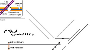
Here, look at this. This is screen capture from the master file. No, I didn't send the file off to R Stevens to be pixellated. This is what it really looks like. Be sure to click these images to see the fine detail.
Oh, the horror.
For the new diagram I started off with a document size of 36 inches square, for not much reason except that it helped me place the old diagram as a template behind the new work. I still expected to print it smaller if I ever printed it at all.
I looked into the idea of printing. Apparently printers have standard sizes, and 36 inches square is not one of them. Neither is 18 inches square. They can do custom sizes, but they'll charge extra to cut the prints down to the custom size. It's actually cheaper to go for the next largest standard size, which is 18 by 24.
So, I changed my document size to 48 wide by 36. I'm not sure I'll really finance a print run, but if I do, I've got something standard.
The printers I've checked seem happy with "bleeding" the art all the way to the edge, but just the same I think I will keep a border area with no text. I might make it into a white border, or extend just lines and background into it. I can decide later.
Here's the entire diagram with the new borders.
So what have I actually done lately?
I've been extending the mainline railroads out to the new border. I started with the top, maybe because it's easy, just three straight lines for Metro North's Hudson, Harlem, and New Haven routes.
Here is that, done, July 18.
Notice how the spacing between stations becomes compressed. This works for me. I hope it gives you the same impression. You know somehow that the stations are farther apart out there away from the city. It's like perspective. It is somehow OK to see the stations all bunched together, even though you know they are actually much farther apart than subway stations. Right?
I realized I should try to work that idea in the more complicated space of Long Island.
The non-square boundaries mean I can't take Metro North as far out as the east and west routes in Long Island and New Jersey. This bothers me, but I don't see what I can do about it. I did get Metro North as far as Croton-Harmon, North White Plains, and Stamford, which are the ends of the frequent local services.
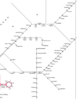
Here's Long Island on its way, July 24. This goes out as far as Babylon and Ronkonkoma, the ends of electric service.
You might notice that I moved the end of the Far Rockaway subway line.
The Hempstead branches were bothering me, and I made an alternate version. I was trying to line up the Hempstead and Oyster Bay branches. I discarded this idea though as needless.
Below, Long Island is done. As I said, not fair to Metro North, because this covers most of the Long Island services, more so than the Metro North lines.
I'm still working out New Jersey, but here's the whole map as of this evening. The left side may change considerably.
Continued: Making a Subway Map X.


